Around 53% of website visitors exit the site if it takes too long to load a landing page. The stats are troubling, and you certainly don’t want users to leave your website and increase bounce rate.
Then, what you’re supposed to do?
The answer lies in providing top-tier user experience. Instead of focusing only on the aesthetics of a website, understand why a user visits a website. Your job is to facilitate the visitor by offering exceptional navigation, so they can finish the task and convert.
Remember, websites serve as the face of a business and demonstrate what users should expect from the respective company. And to ace this first impression, you need to keep an eye on the following factors to ensure an unmatched user experience.
Understanding User Experience
Before we explore those factors, let’s understand what user experience is.
While working on a website, get enough clarity on how you’ll be using it. Will you sell online courses on it? Or, will it be an e-commerce store? When you know the exact purpose, the rest of the design journey will be quick and hassle-free.
With that purpose in your mind, you can also decide on who will be your target audience and you will incorporate the features accordingly. Suppose, you want to educate your visitors on a certain topic or issue, you’ll need to keep the content organized on your website.
Whereas, if you want visitors to buy your products, work on each step from when they first visit your site to checkout, to provide a one-of-its-kind user experience.
Simply put, user experience deals with a visitor’s experience on a particular website. It also includes a few factors, such as how users will be using features on a website, ranging from navigation tools to contact forms.
Factors to Avoid and Ensure Better User Experience
Let’s take a look at the factors that affect user experience adversely.
1) Busy Website Design

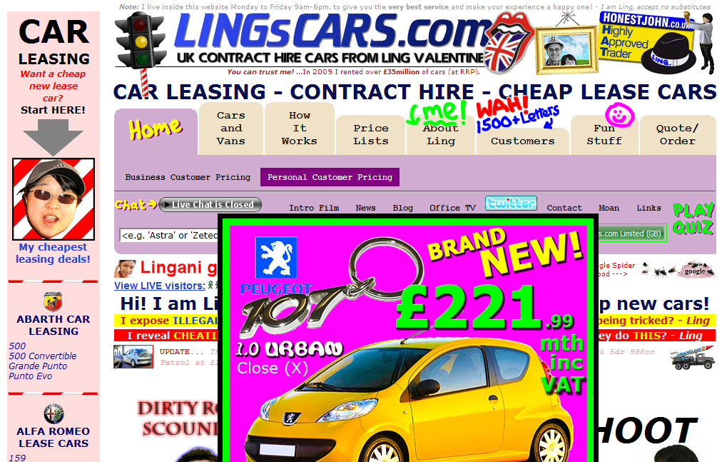
Remember, whatever graphics you incorporate into your website design with breadcrumb, they can help, delight, confuse, or even annoy visitors. For example, flashy or look-at-me type elements, such as animated GIFs from the mid-90s are a major drawback. And, incorporating an auto-play video is a not-so-good idea, so you need to avoid it, too.
More so, to improve user experience on your website, focus on placing common navigation elements in front of the visitors. From search to contact, keep essential navigation on the forefront to accommodate more and more users.
When working on navigation, try to maintain balance as too much navigation or too clever navigation, such as non-standard style can confuse a visitor.
Also, don’t go for the text, images, and elements that are too big or small, because this practice can ruin the aesthetics of a website design. You need to aim for the size that stays easy on the eyes. And for icons, avoid adding the confusing ones, as they don’t always represent what you want to convey.
2) Thin, Sleek Fonts

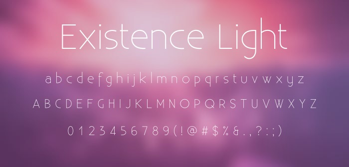
Elegant, clean, sleek, and trendy fonts look incredibly beautiful. And you can find tons of varieties when it comes to choosing a stylish font for your website. However, the problem is thin typefaces contribute to usability issues and lead to user experience vulnerabilities, ultimately.
When deciding on the font, it’s best to identify its goal. For example, the text on the website needs to be legible or clear. But when you use thin fonts, it creates readability issues. What’s even troubling? Not all visitors will be reading that text from screens that renders sleek and thin font well.
3) Using Stock Images
You’ve found a relevant stock photo and decided to use it on your website. The job is done in just a few minutes. But what if we tell you it’s a wrong practice and lead to bad user experience. Oftentimes, these stock images are used across different websites. This practice can also damage your business’s perception.
Take this scenario for an example, you’re selling premium quality service or product, and then end up using a collection of photos that anyone can find online. It certainly won’t look good and put question mark on your credibility.
Using unique and relevant imagery boosts the aesthetics of the website and engages a user to some extent. But, without these qualities, those stock photos become a mere factor that put negative influence on the user experience.
4) Bad Quality Links

Ensure to provide required information without hindrance. If a user managed to come to your website, they’re likely in search of particular information, service or product your website deals with.
In their entire journey, coming across a broken link can ruin the entire process. After that, not only they’ll exit the page, but prefer your competitors over you in the future.
Understand that broken links are serious user experience drawback that also influence conversion rate. On the flipside, web crawlers also detect broken or invalid link and register it as an empty page.
The empty page means it doesn’t offer new content, making your website look dated. This situation further leads to lower ranking on search engine result pages.
5) Visual Element Placement
You might haven’t think about it but a user experience is also based on visual element placements. That influence the following sensory levels:
Sight
When talking about sight, ensure that your web design website looks organized and structured at first sight.
Your website should also be easy to navigate and allow users to reach purchase page or contact us page without consuming additional minutes.
Lookout for empty links and remove them and other irrelevant elements from your site. Your aim here is to engage website visitors, not to overwhelm them.
Identity
Use your website to convey who you are as a business and what value do you offer.
While building your website, focus on factors, such as what sets your product or service apart from your competitors.
Whatever your answer will be, make sure your website reflects it.
Take Away!
User experience, undoubtedly, can make or break a website. In today’s fast pace and tech-centric world, no one would stick around a website that takes it sweet time to load completely. If a user don’t get the desired results in three seconds, they’ll move to a faster and better option.
From navigation to imagery, several factors contribute to the experience of visitors on your website. Focus on these factors and run A/B testing to ensure your website does the job flawlessly.


